We’ve got two weeks of international football coming our way, so I thought I’d do something on the World Cup and who gets to qualify for it. Specifically, whether certain confederations (to borrow FIFA’s terminology) like UEFA or CONMEBOL (the South American equivalent of UEFA) are over-represented at the World Cup.
(Before I get into this, I want to let everyone know that I don’t really have an agenda, I’m just doing this because it seemed like something worth doing. I mean, the headline could just as well have been something dry like ‘World Cup Qualification 1930 – 2014’.)
I tried to use various criteria to judge how over- or under- represented a confederation is. Population size, area of the globe covered, contribution to the world’s GDP, military expenditure and FIFA’s own world rankings. I go into why I selected these factors and how I calculated them in the methodology portion of this post below. (I could have gone into it now but I didn’t want to drive away someone who may be a casual reader and is just looking to play with the Tableau visualization a bit. Want to make sure she or he gets something out of this post too.)
Simply put, what I’m saying is that, if say, the countries in Africa together have 20% of the world's population, they might have grounds for asking for 20% of the 32 places in the World Cup too. (Or 31 places, given that the tournament hosts qualify automatically.)
WHAT’S IN IT
So what do you get in the visualization? There are three charts- top-left is a bar chart which shows us how many slots out of the 31 available should be given to a confederation according to the various criteria mentioned. You use the drop-down menu to select a confederation, and the bars will resize according to the confederation’s ‘strength’ in the respective field.
If you look to the right of the confederation drop-down menu, you will see an option for ‘Actual no. / percentage’. If you select ‘percentage’, what it does simply is recalculate with the base as 100 instead of 31 in the ‘Actual no.’ option. Incidentally, changing that will affect both the bar and the pie chart to its right. The pie chart is nothing but the distribution of seats among the various confederations according to the criterion you choose in the drop-down menu above it.
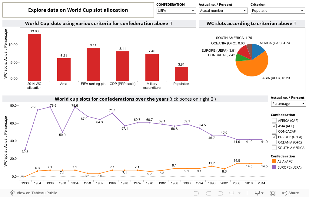
Finally, the line chart at the bottom gives us the number of slots awarded to each confederation over the years. So you tick the boxes of the confederation you’re interested in learning about and lines will appear along with a colour legend to let you know what’s what. Again, you can get the actual number of slots competed for or you could get the percentage of slots awarded. In this case, using percentage makes the figures comparable across years, because the base kept changing as the tournament got bigger, from 14 to 22 to 30 and now 31. So using percentage instead of the actual number of slots gives us a truer picture of how confederations have been treated by FIFA over the years.
WHAT TO LOOK AT
If you want some initial advice on what options to choose, I have just two words for you--dig in! Now you can pretty much guess what most options will result in. (With two exceptions that I will come to later.) For example, if you choose population for the pie-chart, you know that it will grant the majority of slots to the Asian federation because China’s there. Or that if you choose military expenditure, CONCACAF (Confederation of North, Central American and Caribbean Association Football) will get most of the slots because of the US and its huge defense budget.
What I did find interesting was that if you take the UEFA option in the bar chart, according to every single criterion I use, the 13 seats Europe has been allocated is more than it deserves. (That should be the default view you’re presented with as your data viz loads.) Apart from Europe, if you click on Oceania and look at the FIFA ranking, Oceania is surprisingly under-represented. Long the forgotten step-child of FIFA, its winner having to compete every 4 years in a playoff with a nation from Asia or South-America depending on which side of the bed Sepp Blatter’s gotten up from, it seems its member states have actually been doing well enough for the region to get its own automatic qualifying spot.
THE PLEA
The way things are now, spots at the World Cup are gained and lost through a long attritional process of negotiation and horse-trading and there is hardly any transparency to the procedure at all. There is no periodic reassessment of the slots a confederation is awarded, in the way UEFA does when it takes a Champions League spot away from Serie A and gives it to the Bundesliga; not because the German FA haggled harder but because German teams performed better and a consensually-agreed upon statistical formula rewarded them for that. I realize that this is an issue that most people aren’t really aware of but if I’ve made this an issue that people discuss, or at least think about, then the purpose of this blog-post is served.
Things are going to get a bit boring from here on out, so if I’m already testing your patience with this long blog post, you can get on with the rest of your day. Thanks for stopping by!
------------------------------------------------------------------------------------------------------------
HOUSE-KEEPING
Ok, now to explain my methods.
All that I did was calculate weights according to how much each confederation contributed to the world’s area, its population, the GDP (PPP) and the military expenditure. Got the figures for the first three criteria from the CIA World Factbook and the military expenditure data from the SIPRI military expenditure database
Now why did I choose these criteria? I guess I took the ‘world’ in ‘World Cup’ a little too literally, and was determined to find out how much of the world was actually represented at the tournament. So factors like area covered and population size seemed natural indicators to use. GDP (PPP), I guess, was used as some sort of proxy for economic power and military expenditure as a proxy indicator for political power. I still have reservations over using military expenditure but in the absence of another readily-available indicator I could borrow to represent political influence, SIPRI’s data will have to do.
I kind of anticipated the objection people would make that the World Cup is not just about representation but also about merit and about the world’s best teams playing each other. So I used FIFA’s ranking data to arrive at some kind of meritocratic measure.
In order to arrive at the strength of a confederation, what I did was calculate the average number of points of the top 10 nations in each confederation and used that to arrive at a weight. Now I think that’s a relatively unsophisticated but still reasonable way of going about it but if anyone has a different and better idea of how it should be done, do let me know at [email protected] and I'll make sure to incorporate that method in the next visualization I make (whenever that is). I'd also be interested in seeing your take on this and in fact, I would welcome it if you could use the dataset provided and make your own graph, chart etc. with your software of choice.
VIEW DATASET
The historical data for the line chart I got from, where else?, RSSSF.com.
FOOTNOTES INDICATOR-WISE
SIPRI military data
--Now all the SIPRI figures are from 2011 and I've taken a few shortcuts that academics might have heart-attacks over, such as using 2009 figures when there are no 2011 figures available for a country. Now this isn't meant for publication in an academic journal, so I think getting some sort of idea is better than having no insight at all.
--This is what I did, I took the figures for Central African Republic from 2010, Benin from 2008, Equatorial Guinea put at 0, Iceland from 2009, Iran from 2008, Reluctantly put North Korea at 0, Libya from 2008, Luxembourg from 2007, Malawi from 2007, Mauritania from 2009, Myanmar at 0, Somalia at 0, Sudan from 2006, Qatar from 2008, Tajikistan from 2004, Turkmenistan from 1999, Uzbekistan from 2003, Yemen from 2008. Also, countries put at 0 are most likely not at 0, did it that way because SIPRI didn't have figures for them.
Population indicator
--Used figures from Gaza and West Bank in CIA Factbook for Palestine
--Used figures from French Polynesia in CIA Factbook for Tahiti
Historical timeline data
--Playoff places are counted as 0.5, seems to be the best way to deal with that problem
--What created additional problems for me was that FIFA used to adjust qualifying places according to which continent was hosting and whether a country from that continent was the defending champion. For eg. In Italia 90, countries from South America were competing for 2.5 places, instead of the 4 places on offer in Mexico'86 because Argentina was the defending champion. So then the Q. is whether I should consider CONMEBOL as up for 2.5 slots or 3.5 slots including Argentina?
--Up to and including 1982, Oceania didn’t have a separate group of its own but instead was treated as part of Asia. There were quasi-Oceania type groups though in the Asian zone for the 1978 and 1982 World Cups but not before that.
--Africa only got a separate slot of its own from 1970 onwards; there were combined Asia, Africa and Oceania groups before that.
--Just 13 teams were at the 1950 World Cup, but a lot of teams that had otherwise qualified withdrew, so I'm going to treat it as the 16 team tournament it was meant to be
--1938 was meant to be a 16 team tournament but only 15 teams competed
--In the inaugural World Cup, there was no qualification, so I'm going to just count the affiliations of those who were invited
COMMENTS INVITED -- BE NICE!
If you have to be critical, be gentle, imagine that I'm a friend standing in front of you and you're trying not to hurt my feelings but still hope to point out where I went wrong. Please don't use the fact you're not with me in person as a license to be mean!
(Before I get into this, I want to let everyone know that I don’t really have an agenda, I’m just doing this because it seemed like something worth doing. I mean, the headline could just as well have been something dry like ‘World Cup Qualification 1930 – 2014’.)
I tried to use various criteria to judge how over- or under- represented a confederation is. Population size, area of the globe covered, contribution to the world’s GDP, military expenditure and FIFA’s own world rankings. I go into why I selected these factors and how I calculated them in the methodology portion of this post below. (I could have gone into it now but I didn’t want to drive away someone who may be a casual reader and is just looking to play with the Tableau visualization a bit. Want to make sure she or he gets something out of this post too.)
Simply put, what I’m saying is that, if say, the countries in Africa together have 20% of the world's population, they might have grounds for asking for 20% of the 32 places in the World Cup too. (Or 31 places, given that the tournament hosts qualify automatically.)
WHAT’S IN IT
So what do you get in the visualization? There are three charts- top-left is a bar chart which shows us how many slots out of the 31 available should be given to a confederation according to the various criteria mentioned. You use the drop-down menu to select a confederation, and the bars will resize according to the confederation’s ‘strength’ in the respective field.
If you look to the right of the confederation drop-down menu, you will see an option for ‘Actual no. / percentage’. If you select ‘percentage’, what it does simply is recalculate with the base as 100 instead of 31 in the ‘Actual no.’ option. Incidentally, changing that will affect both the bar and the pie chart to its right. The pie chart is nothing but the distribution of seats among the various confederations according to the criterion you choose in the drop-down menu above it.
Finally, the line chart at the bottom gives us the number of slots awarded to each confederation over the years. So you tick the boxes of the confederation you’re interested in learning about and lines will appear along with a colour legend to let you know what’s what. Again, you can get the actual number of slots competed for or you could get the percentage of slots awarded. In this case, using percentage makes the figures comparable across years, because the base kept changing as the tournament got bigger, from 14 to 22 to 30 and now 31. So using percentage instead of the actual number of slots gives us a truer picture of how confederations have been treated by FIFA over the years.
WHAT TO LOOK AT
If you want some initial advice on what options to choose, I have just two words for you--dig in! Now you can pretty much guess what most options will result in. (With two exceptions that I will come to later.) For example, if you choose population for the pie-chart, you know that it will grant the majority of slots to the Asian federation because China’s there. Or that if you choose military expenditure, CONCACAF (Confederation of North, Central American and Caribbean Association Football) will get most of the slots because of the US and its huge defense budget.
What I did find interesting was that if you take the UEFA option in the bar chart, according to every single criterion I use, the 13 seats Europe has been allocated is more than it deserves. (That should be the default view you’re presented with as your data viz loads.) Apart from Europe, if you click on Oceania and look at the FIFA ranking, Oceania is surprisingly under-represented. Long the forgotten step-child of FIFA, its winner having to compete every 4 years in a playoff with a nation from Asia or South-America depending on which side of the bed Sepp Blatter’s gotten up from, it seems its member states have actually been doing well enough for the region to get its own automatic qualifying spot.
THE PLEA
The way things are now, spots at the World Cup are gained and lost through a long attritional process of negotiation and horse-trading and there is hardly any transparency to the procedure at all. There is no periodic reassessment of the slots a confederation is awarded, in the way UEFA does when it takes a Champions League spot away from Serie A and gives it to the Bundesliga; not because the German FA haggled harder but because German teams performed better and a consensually-agreed upon statistical formula rewarded them for that. I realize that this is an issue that most people aren’t really aware of but if I’ve made this an issue that people discuss, or at least think about, then the purpose of this blog-post is served.
Things are going to get a bit boring from here on out, so if I’m already testing your patience with this long blog post, you can get on with the rest of your day. Thanks for stopping by!
------------------------------------------------------------------------------------------------------------
HOUSE-KEEPING
Ok, now to explain my methods.
All that I did was calculate weights according to how much each confederation contributed to the world’s area, its population, the GDP (PPP) and the military expenditure. Got the figures for the first three criteria from the CIA World Factbook and the military expenditure data from the SIPRI military expenditure database
Now why did I choose these criteria? I guess I took the ‘world’ in ‘World Cup’ a little too literally, and was determined to find out how much of the world was actually represented at the tournament. So factors like area covered and population size seemed natural indicators to use. GDP (PPP), I guess, was used as some sort of proxy for economic power and military expenditure as a proxy indicator for political power. I still have reservations over using military expenditure but in the absence of another readily-available indicator I could borrow to represent political influence, SIPRI’s data will have to do.
I kind of anticipated the objection people would make that the World Cup is not just about representation but also about merit and about the world’s best teams playing each other. So I used FIFA’s ranking data to arrive at some kind of meritocratic measure.
In order to arrive at the strength of a confederation, what I did was calculate the average number of points of the top 10 nations in each confederation and used that to arrive at a weight. Now I think that’s a relatively unsophisticated but still reasonable way of going about it but if anyone has a different and better idea of how it should be done, do let me know at [email protected] and I'll make sure to incorporate that method in the next visualization I make (whenever that is). I'd also be interested in seeing your take on this and in fact, I would welcome it if you could use the dataset provided and make your own graph, chart etc. with your software of choice.
VIEW DATASET
The historical data for the line chart I got from, where else?, RSSSF.com.
FOOTNOTES INDICATOR-WISE
SIPRI military data
--Now all the SIPRI figures are from 2011 and I've taken a few shortcuts that academics might have heart-attacks over, such as using 2009 figures when there are no 2011 figures available for a country. Now this isn't meant for publication in an academic journal, so I think getting some sort of idea is better than having no insight at all.
--This is what I did, I took the figures for Central African Republic from 2010, Benin from 2008, Equatorial Guinea put at 0, Iceland from 2009, Iran from 2008, Reluctantly put North Korea at 0, Libya from 2008, Luxembourg from 2007, Malawi from 2007, Mauritania from 2009, Myanmar at 0, Somalia at 0, Sudan from 2006, Qatar from 2008, Tajikistan from 2004, Turkmenistan from 1999, Uzbekistan from 2003, Yemen from 2008. Also, countries put at 0 are most likely not at 0, did it that way because SIPRI didn't have figures for them.
Population indicator
--Used figures from Gaza and West Bank in CIA Factbook for Palestine
--Used figures from French Polynesia in CIA Factbook for Tahiti
Historical timeline data
--Playoff places are counted as 0.5, seems to be the best way to deal with that problem
--What created additional problems for me was that FIFA used to adjust qualifying places according to which continent was hosting and whether a country from that continent was the defending champion. For eg. In Italia 90, countries from South America were competing for 2.5 places, instead of the 4 places on offer in Mexico'86 because Argentina was the defending champion. So then the Q. is whether I should consider CONMEBOL as up for 2.5 slots or 3.5 slots including Argentina?
--Up to and including 1982, Oceania didn’t have a separate group of its own but instead was treated as part of Asia. There were quasi-Oceania type groups though in the Asian zone for the 1978 and 1982 World Cups but not before that.
--Africa only got a separate slot of its own from 1970 onwards; there were combined Asia, Africa and Oceania groups before that.
--Just 13 teams were at the 1950 World Cup, but a lot of teams that had otherwise qualified withdrew, so I'm going to treat it as the 16 team tournament it was meant to be
--1938 was meant to be a 16 team tournament but only 15 teams competed
--In the inaugural World Cup, there was no qualification, so I'm going to just count the affiliations of those who were invited
COMMENTS INVITED -- BE NICE!
If you have to be critical, be gentle, imagine that I'm a friend standing in front of you and you're trying not to hurt my feelings but still hope to point out where I went wrong. Please don't use the fact you're not with me in person as a license to be mean!
A very nice piece of work. On 'the plea', I agree that the current 'negotiation' approach is weak, but previously thought that taking a coefficient/ranking approach could simply entrench the current disparity, as if a region is already under-represented, its teams wouldn't have the opportunity to play at the tournaments/in the matches that get them points, and so they could get 'stuck' where they are. However from your figures, using rankings would seem to even things out a little better, so that's a useful insight.
ReplyDeleteUsing other figures has some problems - population would particularly invoke the question of India; and any financial benchmark would be inappropriate, I think. Certainly an interesting discussion to start, thanks!
Appreciate the kind words and the RT on Twitter, Philippa! About the coefficient approach, it would seem that nations from Europe and South America would be getting more out of it than most because they routinely do better at world cups but the way the FIFA world rankings work, they also take into consideration regional tournaments and friendlies, so there are plenty of opportunities for the minnows of international football to gain points even if not all of them qualify for the world cup. They certainly seem to deserve more than they're getting now in terms of World Cup slots, especially Oceania.
DeleteAgree about the use of economic or political benchmarks, was just kind of playing with the idea of re-imagining the world cup in a way that reflected the world we live in. I certainly wouldn't condone it, might play into a kind of 'might is right' approach which I don't subscribe to anyway. But I do believe the world cup could do with being more representative though, the FIFA rankings may not be the answer but it seems like a good place to start!
Thanks for sharing valuable information. Your blogs were helpful to tableau learners. I
ReplyDeleterequest to update the blog through step-by-step. Also, find the tableau news at
Tableau Online Training Blog.
Thanks for sharing valuable information. Your blogs were helpful to tableau learners. I
ReplyDeleterequest to update the blog through step-by-step. Also, find the tableau news at
Tableau Online Training Bangalore Blog.
Articles, while lacking this direct engagement, can still receive comments and social media shares when published on platforms that facilitate reader interaction. Hulu Best VPN Both blogs and articles offer opportunities for monetization. Bloggers can earn through various means.
ReplyDelete